


Inspired by this Neon post by Plenty of Colour, here is a bunch of beautiful NEON typography spotted on some of my travels:
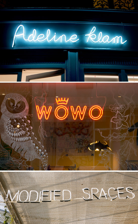
Adeline Klam boutique – Paris, France
WoWo children's clothing – Paris, France
Modified Spaces @ Verbeke Foundation – Kemzeke, Belgium
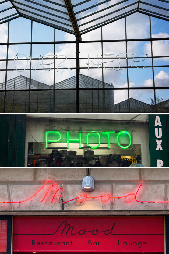
Over Here @ Verbeke Foundation – Kemzeke, Belgium
Photo store – Paris, France
Mood restaurant bar lounge – Paris, France
To see more travel typography: part 1 and part 2 and part 3 and part 4 and part 5 and part 6 and part 7 and part 8 and part 9 and part 10 and part 11 and part 12!

LOVE Neon Signs…
:o)
Oh I love these signs! I always dream of having one in my appartment (can't be the most energy savy decoration, but who cares ;)). Especially the script type in the first picture is adorable!
It's my favorite too! The inside of Adeline Klam's boutique is super cute as well. Definitely a “must” when you visit Paris. More pictures here: http://jillianinitaly.com/2013/01/07/guest-post-joelix-2/
Hi Judith. Neon typography is very attractive, i also dream of having one at home but so far never managed to find the good one at the right time (always on holiday, but… Well, not easy to take it back home by plane with me ;-)
Sometimes not on holiday but huge, too big for my space. Maybe one day.
Realli enjoy your type-posts :-)
Thanks Stefania! I'm sure some day you'll find the perfect NEON for your place. And if not, you can always buy a few small letters (by Seletti for example) and have them delivered to your doorstep… not as fun as finding a cool vintage big one, but well ;)
Thanks for the tip, I will check it out. It would be nice and easy this way :-)
:o)