


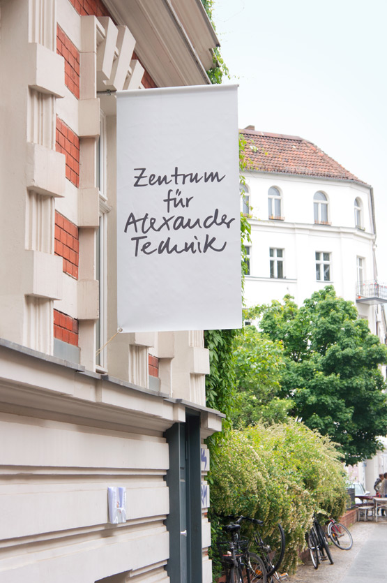
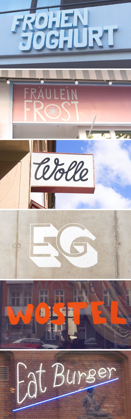
Beautiful typography spotted on my recent trip to Berlin:
Alexander Technik center – Berlin, Germany
Frohen Yogurt (German pun: frohen means happy) – Berlin, Germany
Fräulein Frost (frozen yogurt) – Berlin, Germany
Fadeninsel (wool store) – Berlin, Germany
EG (Planet Modulor) – Berlin, Germany
Wostel (event and co-working space) – Berlin, Germany
Eat Burger – Berlin, Germany
► To see all previous editions of The Typography of Travel, click here. Also, if you'd like to contribute beautiful type from your travels to this series, drop me a line!

Great set Judith, love the EG type!
Me too! I think it's my favorite from this series :) Have a great weekend Stefania!
Love the wostel one!! happy and relaxing weekend.
Merci! Hope you are having a good one too!
Leuk dat je dat is opgevallen daar.
Ik ben meer een Fraulein Frost -type, geloof ik!
(en ik wil ook naar Berlijn!!)
Fräulein Frost is ook mooi… èn ze hebben er heerlijk ijs ;)
nice :)
merci Petra!
Great examples. I am still patiently waiting for your handwritten fonts to embellish my blogposts:-))) Bon week-end mon amie!
Hahaha merci Igor! I'd be happy to make you some custom wording ;) Enjoy your Sunday evening!