


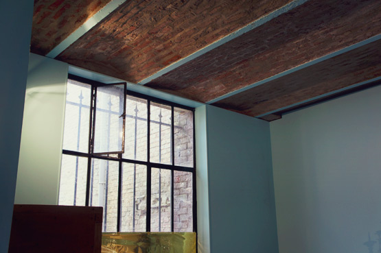
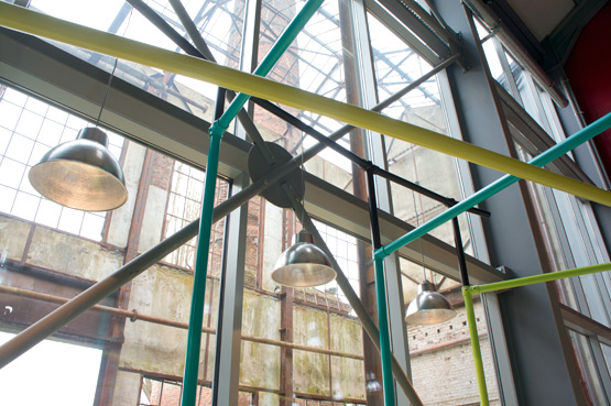
Last week I showed you some pictures of the Sugar Factory in Francières. The weather was rather gloomy and like for our first visit, I photographed in black & white. Today I'll take you inside where it's a little bit more colorful (but also colder than outside!).
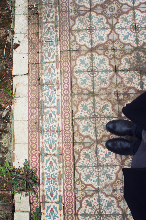
I really liked the color of the walls in the factory's chapel. It looks rather contemporary, but old pictures of the chapel before the renovation, show exactly the same colored walls! The minty blue ( or how would you call this color? ) goes perfectly well with these tiles:
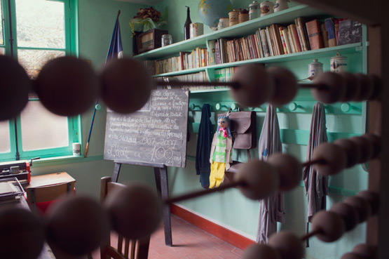
In the factory's school they used a slightly different shade of minty green/blue. I never knew it used to be such a fashionable color!
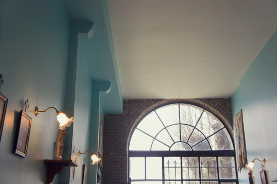
In the main factory, which now houses a permanent exhibition on today's agricultural industry in France, the architects cleverly re-used this color:
Minty green/blue, jungle green, toothpaste green, jade, aqua blue… What would you call this color?

This place is wonderful and the colour is so fresh, it brings Spring just by looking at it. Remember the name “carta da zucchero” ;-) xx
Wow that is the PERFECT name for this color! Merci Ilaria!
Wow, those vintage tiles look fabulous!!! Love the inspiration that comes from old spaces such as factories. Happy new week!!
Thanks Igor! Wouldn't they look great in a kitchen or as a “fake” carpet in front of a fireplace?! Happy week to you too!
Sucrerie-vert!!
Yes!! Or like Ilaria suggested above: “carta da zucchero”: the green color of the blue sugar packaging that faded and became this pale green/blue color! Perfect!
Aqua perhaps?
Wat een schiiterende vloer trouwens ook.
Ja he? Ik zou hem graag oppakken en meenemen ;o)
Toothpaste green covers it quite well. Nice photos and nice place :-)
Merci Stefania! You immediately understand what that color is about, right?
Aqua- Linden- Emerald- geen with a Minty hint ;)
Hahahaha that's a long name :D
A sage green…I like carta da zucchero… sounds perfect..
Great images..
Such a perfect name, right? Thanks Tina! Et bonne nuit :o)
Looks just like “Eau de Nil” that covered every wall of official buildings (schools, courthouses, offices, etc) in the 50's.
You're so right! That's exactly it! Thanks Rebecca!
What a stunner of a building and brilliantly captured as always!
Hmmm, acqua? Duck egg blue? It's beautiful.
Love that they went to such trouble with the outdoor tiles. :)
duck egg blue! That's also really close! I would have loved picking up the tiles to take them home ;o)
This is fascinating. I always thought these tiles were specific to Berlin hallways, but I should have known better!
My first thought when spotting the tiles was: this is soooo “Berlin”! Sandra Juto takes pictures of these kind of tiles in Berliner entry halls all the time! But apparently they liked them here too :o)