


Beautiful typography spotted on some of my travels:
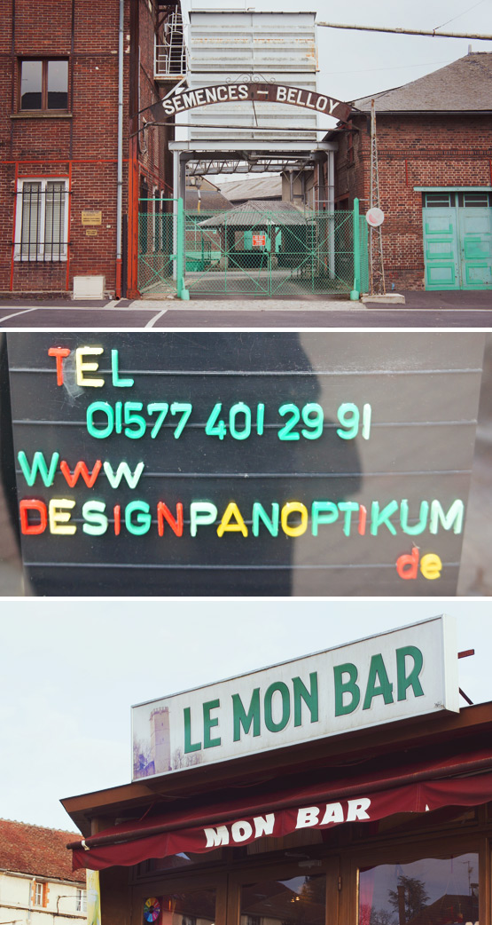
Belloy et Cie (seeds & grains) – Estrées-Saint-Denis, France
Design Panoptikum (museum of extraordinary objects) – Berlin, Germany
Le Mon Bar – Montbard, France
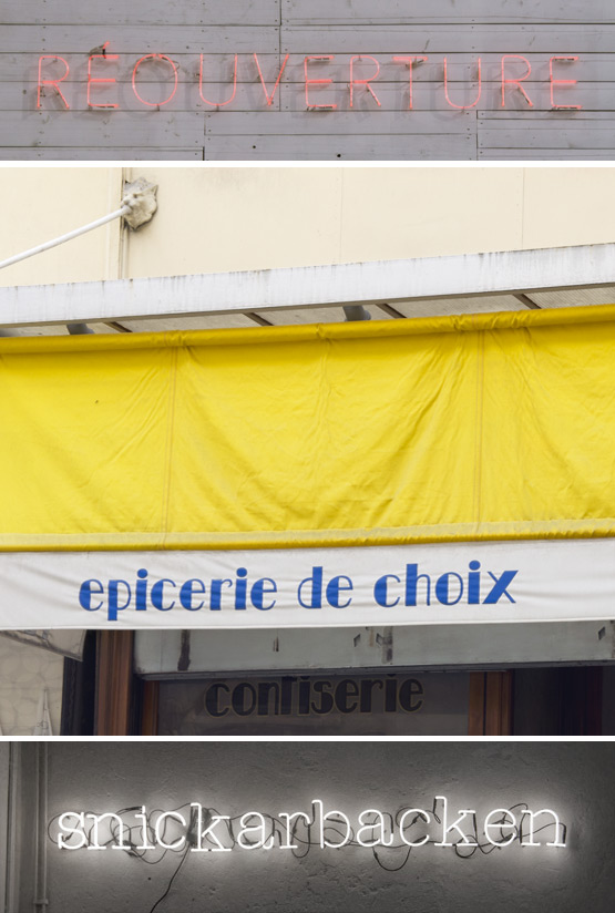
Comédie Musicale theatre – Paris, France
Grocery store Tetrel – Paris, France
Snickarbacken (concept store) – Stockholm, Sweden
To see more travel typography: part 1 and part 2 and part 3 and part 4 and part 5 and part 6 and part 7 and part 8 and part 9 and part 10 and part 11 and part 12 and part 13 and part 14 and part 15!

I'm really enjoying your typo series – and today it even gave me a tip for my hometown. Design Panoptikum sounds like an interesting place!
It's a really cool and “different” place filled with amazing objects. There's also a small museum, but I didn't dare to go in because the owner freaked me out a little (it was quite dark in there and he started talking before I saw him…). Let me know what you think :o)
I am also very sensitive to sign board while travelling. Nice pics !
Merci Catherine! So nice to spot nice fonts & signs everywhere, right?!
Fabulous snaps as usual, Judith! I particularly love the colors of the Designpanoptikum signage:-)
Merci Igor! The Design Panoptikum letters are so happy ;o) And the place itself is pretty amazing too… Have you ever been there?
I will second that, Igor!
hahaha :o)
Hi Judith, great snaps. I like the rounded typography of snickarbacken. What a great idea for a blog post, have a lovely week x
Merci Geraldine! I think the Snickarbacken letters are by Seletti. Really nice for at home too :o)
Love these! I'm such a typography nerd. :)
My favourite would have to be the bottom one. The combination of the font and fluorescence is unbeatable!
Merci Chi! These letters work.every.single.time! I think they are by Seletti and you can make your own words :o)
These are great. I love typography and signage… they are all good, but love Snickarbacken… hope you're feeling better x
Hahaha you have so much in common with Chi! Food intolerances & the love for neon letters :o) I'm feeling good but this week was/is busy… xxxx